CT Forest & Park User Research
UX research to guide the redesign of an environmental non-profit's website.
The Problem
Environmental non-profits do so much to advocate and care for the world we all share yet they rarely have the resources to invest in digital tools to help support their mission. While a good website experience can help grow donations and membership these organizations often lack funding or internal knowledge to conduct the research necessary to design their user experiences. As a result, even newly redesigned sites struggle to help with goals.
The Solution
I created a preliminary UX research report and user research plan to gain insight about the website users of one of the organizations I support — Connecticut Forest & Park Association (CFPA). Their website is in need of redesign and my plan involves a number of techniques, some of which I’ve already employed, that could be used to learn about their audience and make better design decisions.
Site Requirements
I began by identifying the basic requirements CFPA would have for their site.
Business
Patron management system/payment processing system integration for donations and memberships
E-commerce integration & shop for selling organization publications and merchandise
Section for information on 501c3 status, Board of Directors, Staff, Mission & Vision Statements, Strategic Plan
CTA buttons for donations & memberships
User-friendly content management system
Marketing
Use of logo and brand colors, fonts, and guidelines
CTA button for email sign up
Social media icons/links
Social media content integration
Embedded videos hosted on YouTube
Prominent featuring of photography
Page templates for news stories & events
Integration of/public access to trail map software
User
Responsive design
Easy access to interactive trails map on mobile devices
Optimized load speed on slower networks for access in more remote areas
Calendar/listing of upcoming events
Ability to add events to user's calendar
Information on membership benefits & quick sign-up process
Information on volunteer & advocacy opportunities
Competitive Analysis
I then conducted a competitive analysis of the CFPA site's design, functionality, and content against 3 sites related to outdoor activities and conservation – REI, AllTrails, and the National Audubon Society – in order to understand how the CFPA site ranks and to identify potential inspiration for additions to the CFPA site in these competitor sites.
Each website was given a score of 1-4 in 3 categories: design, functionality, and content. The combination of these 3 scores determined their overall ratings.
Overall Ratings

11.5

7.5

11

5.5
I found that, although CFPA's site is outdated in visual design and media usage, when this is looked past the foundation for effective, usable information architecture and content strategy exists. The site already contains most of the core features of the other sites with 3 notable exceptions:
Responsive design
User-generated content
A membership-focused design for recruiting and signing up new members and involving them in the organization
Interviews & Survey
To understand CFPA’s users I first designed a 10-question interview to conduct with 20 current members of CFPA. The interview questions are focused on understanding:
Who members are
Their experience with the sites
Their needs in a redesign
I also developed a 20-question survey for current site users, both CFPA members and non-members, to understand:
Who are the users of ctwoodlands.org?
What are their main goals in using the site?
What information and features are the most important to them?
What potential improvements are they interested in?
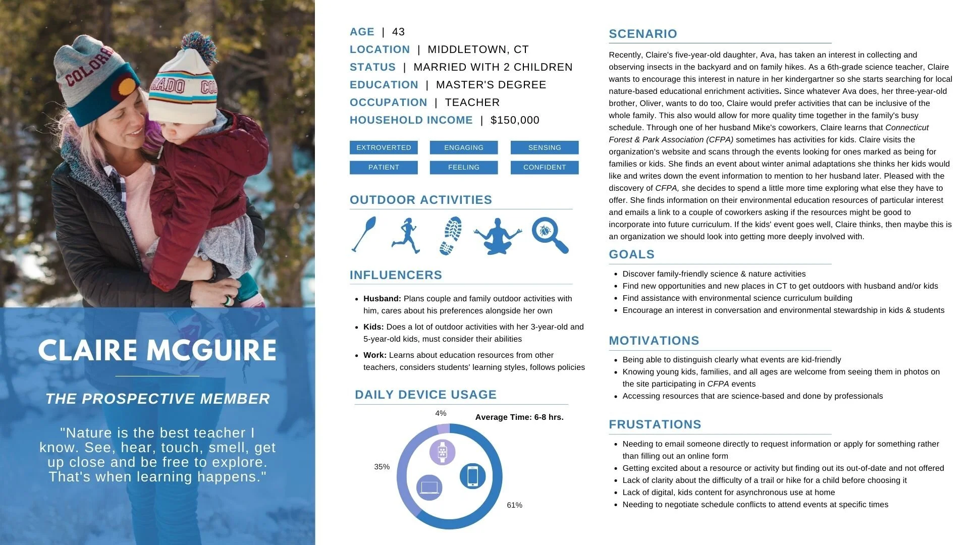
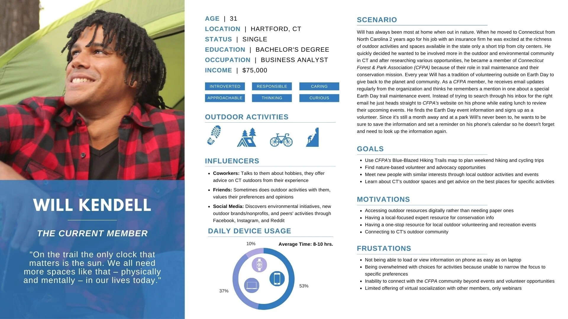
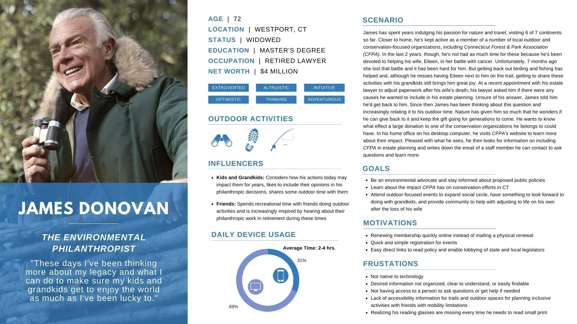
Personas
After doing a couple of interviews with CFPA members, I used the data to create 3 preliminary personas representing current members, prospective members, and donors. Each persona has information on the wants, needs, obstacles, and characteristics of the individual type of user, as well as an accompanying scenario describing how they would go about achieving a specific goal on the site.
Diary Study
Because the organization has a mission of connecting people to the land and already offers an interactive trails map on its current site, I developed a diary study examining site users’ current behaviors in relation to outdoor activities and technology usage.
The study asks participants to respond to a provided set of questions each time they do an outdoor activity over the course of 8 weeks. The questions were designed to understand the role technology plays in outdoor activities and if there is opportunity for the CFPA site to be more of a resource in this area.
Usability Testing
I designed a usability testing study to understand how and why the current site design does or does not meet user expectations and needs. 3 testing sessions were conducted remotely via Zoom in which participants, who were not previously familiar with the CFPA site, were asked to complete 5 tasks. These tasks were related to common user goals and business goals for the site, including:
Recruiting & Signing Up Members
Fundraising
Volunteering
Event Information Sharing & Registration
Accessing & Using the Blue-Blazed Trails Map
Task Completion
Completion Rate: 93%
Mean Completion Time: 2:09 minutes
While participants were mostly able to complete the tasks in short amounts of time with little trouble, the site was not the most well designed for them. During the sessions, I observed that participants struggled to scan pages, locate key information, notice all calls to action, and notice tertiary level navigation.
Heuristic Evaluation
To additionally assess the usability of the current site, a heuristic evaluation was done by a third-party researcher. In this evaluation, the site was examined to see how well it obeyed 10 basic principles of usability.
Overall, the site did well, with the biggest problems being the usability of the global navigation, missing or difficult to locate calls to action, a lack of focus on members, and dated visual design.
Problem Heuristics
Design of system status
Useful features, such as an interactive trail map, hiking information, environmental education are hard to use and do not mirror real-world processes
Consistency and standards
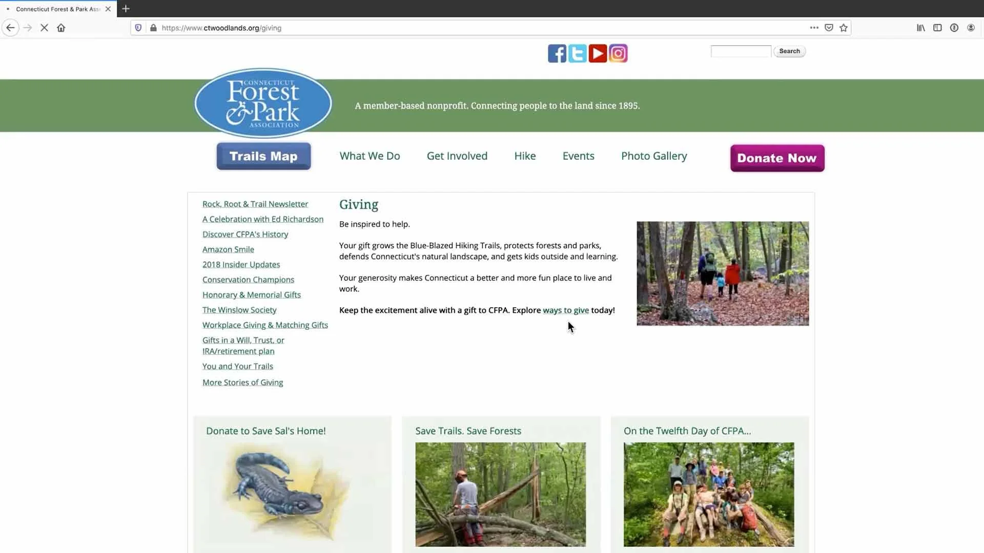
The site offers two different buttons (“Giving” and “Donate”) for donating that link to the same page. The “Giving” option is also listed under the menu category “Get Involved,” but this brings users to a different page about giving.
Recognition rather than recall
The menu options, pages, and buttons are disorganized and it is hard to remember where everything is located and important information is hidden in the footer.
Efficiency and task completion
The organization is member-based, but there is no call-to-action about becoming a member or membership benefits. There is also no log-in/sign-up button to allow returning users to remove unnecessary steps when donating or shopping.
Promote a positive user experience
The visual design of the site is outdated. Information is scattered and it can be difficult to find information
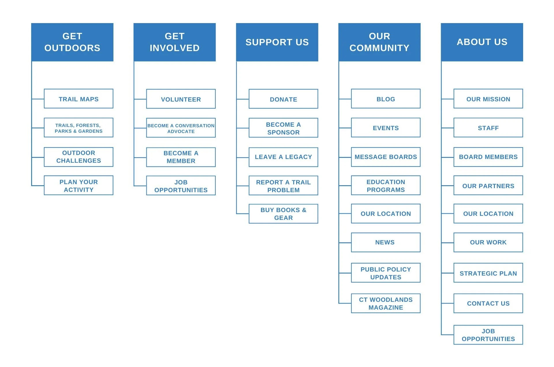
Card Sorting
In response to identifying the site’s global navigation as a problem, in both usability testing and the heuristic evaluation, I developed a new set of categories for the menu and wondered if consolidating categories from the footer menu into the top menu might be helpful.
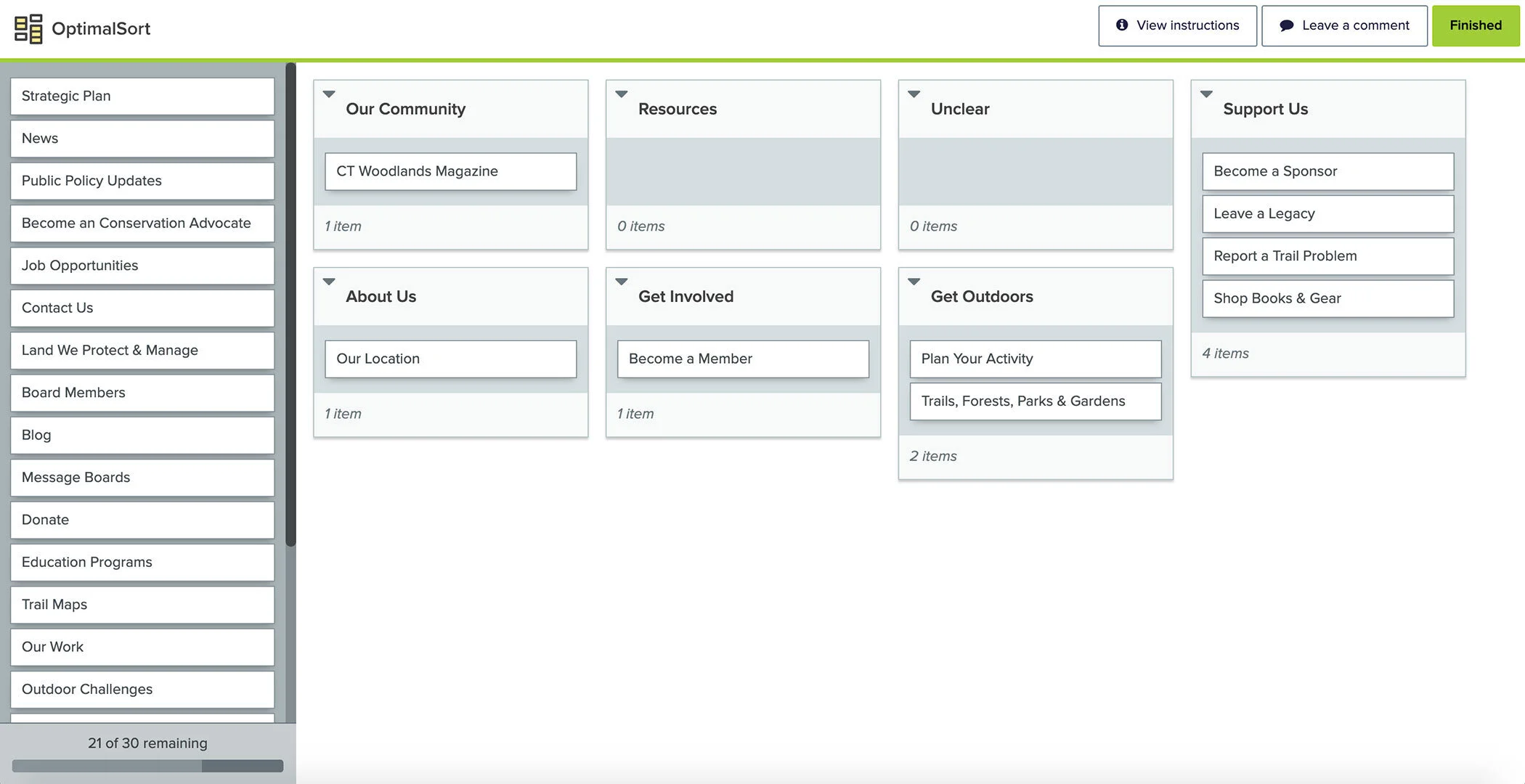
I created and conducted a remote card sorting study using Optimal Workshop with 7 participants, most of whom were not previously familiar with CFPA, to evaluate:
Potential new categories for the top menu
How to condense the contents of the current footer and header menus together
Where proposed expansions of content and functionality needed to be placed
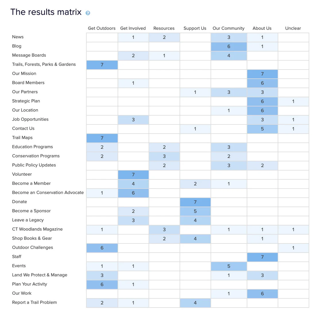
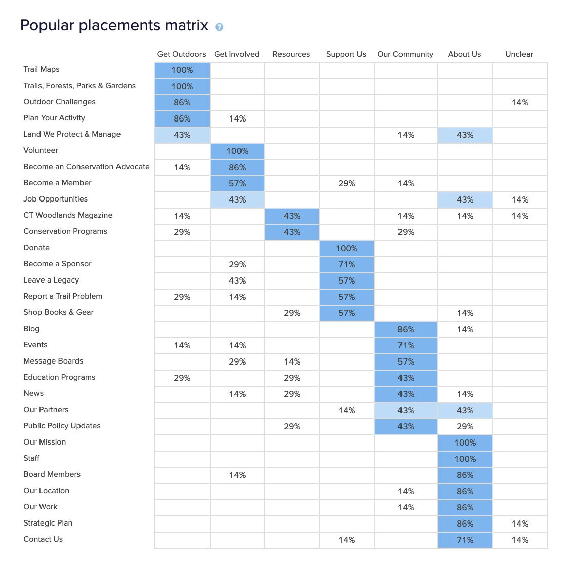
Data from the study confirmed that my information architecture design ideas were mostly aligned with users’ thinking. It helped me develop a new architecture for global navigation based around 5 categories.
Recommendations
The CFPA site turned out to be focused too heavily on just being a repository for information. Beyond updates on events or volunteer opportunities, there was little reason for those associated with CFPA to visit often and little appeal to entice new users to the site.
From my research, I developed the overall recommendation that the site function as both a resource for learning about and planning outdoor activities and as a place for the organization’s community to connect. Not only do these new areas of focus align with the mission of the organization, but they also provide a value-add to site users and for those involved with CFPA.
I was also able to build an extensive list of over 20 initial recommendations for a new design, including:
Refresh the visual design with a more up-to-date and responsive style
Focus content on more photos, video, and media and less text
Optimize content and design for smaller devices and slower internet speeds, such as is often found on trails
Create pages, forms, and call-to-action buttons for memberships
Redesign the global menu to focus on main goals of the site: memberships, fundraising, facilitating outdoor activities, volunteering
Add a search feature to the events calendar and offer filtering by event type
Offer message boards as a place for members and volunteers to connect and talk
Include trail difficulty level and accessibility information on trails map
Include the ability to send a trail map to someone else via a link, email, or social media
Create more clear call-to-action buttons for use in page content
Next Steps
Completing this research plan would require CFPA to:
Conduct the diary study
Conduct more member interviews
Deploy the survey to site users
Update preliminary personas with new interview and survey insights