Long Wharf Theatre Website Redesign
An information architecture and content overhaul to launch a Tony Award-winning regional theatre’s first responsive website.
The Problem
The adoption of a new ticketing system necessitated adopting a new, technologically compatible content management system for the theatre’s website to continue offering online sales. Finances, though, didn’t allow for redesigning the website. A non-responsive site design originally created in 2010 had to be economically adapted to work with a responsive CMS 7 years later.
The Solution
I redesigned the information architecture of the site and worked with an external web development agency to implement small, cost-effective UI changes to ensure the full site was accessible and usable on all device sizes.
Background
In 2017 Long Wharf’s website was still using a design and CMS from 2010. Although it was getting by functionally, I’d been making it clear to leadership in my time there as digital content manager that the lack of responsive design could soon become a liability for the business. 50% of single ticket sales came through the site. The rapid growth of smartphones meant expectations for a responsive ticket buying process were growing. Not meeting expectations could hurt sales and efforts to reach younger audiences.
When the theatre decided to invest in a new ticketing and patron management system they also needed to invest in a new CMS that brought responsiveness with it. Unfortunately, I had to find a way to make the old site design work for a little while longer until a full site overhaul could be done.
Research
I knew one of the problems with the old site design would be figuring out where the left-side menus would move to in order to still be accessible on small screens.
The first thing I did was do a content audit on the pages included on these secondary level left-side menus and looked at their traffic in the last 6 months on Google Analytics.
I then went and talked with various departments about the content in their areas and what was important for their work. I also talked with box office representatives to find out what patrons want to know the most and express having the most trouble finding out. They’d regularly send me notes when patrons said they had trouble on the site before this project so I also consulted those.
Findings
The show listing page and show pages were the most visited
Internal-focused menu labels like “Box Office” were confusing patrons
Patrons had difficulty finding customer service information
The education department had students dependent on smartphones for internet access who struggled to use the site
The box office often walked patrons through where to find information on the site over the phone
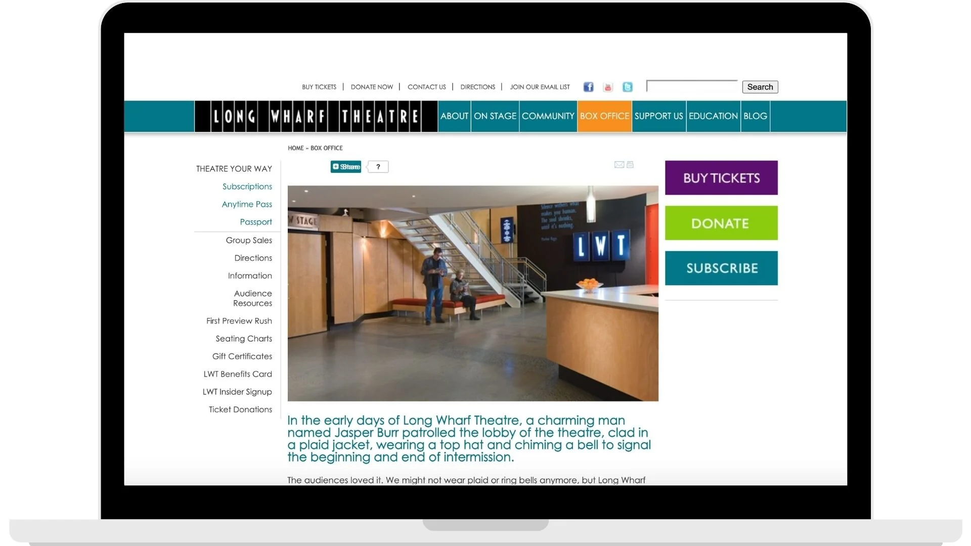
Section landing pages had little helpful content and users spent little time on these pages
Many pages listed on secondary-level menus were niche, held limited information, and saw little traffic
Design
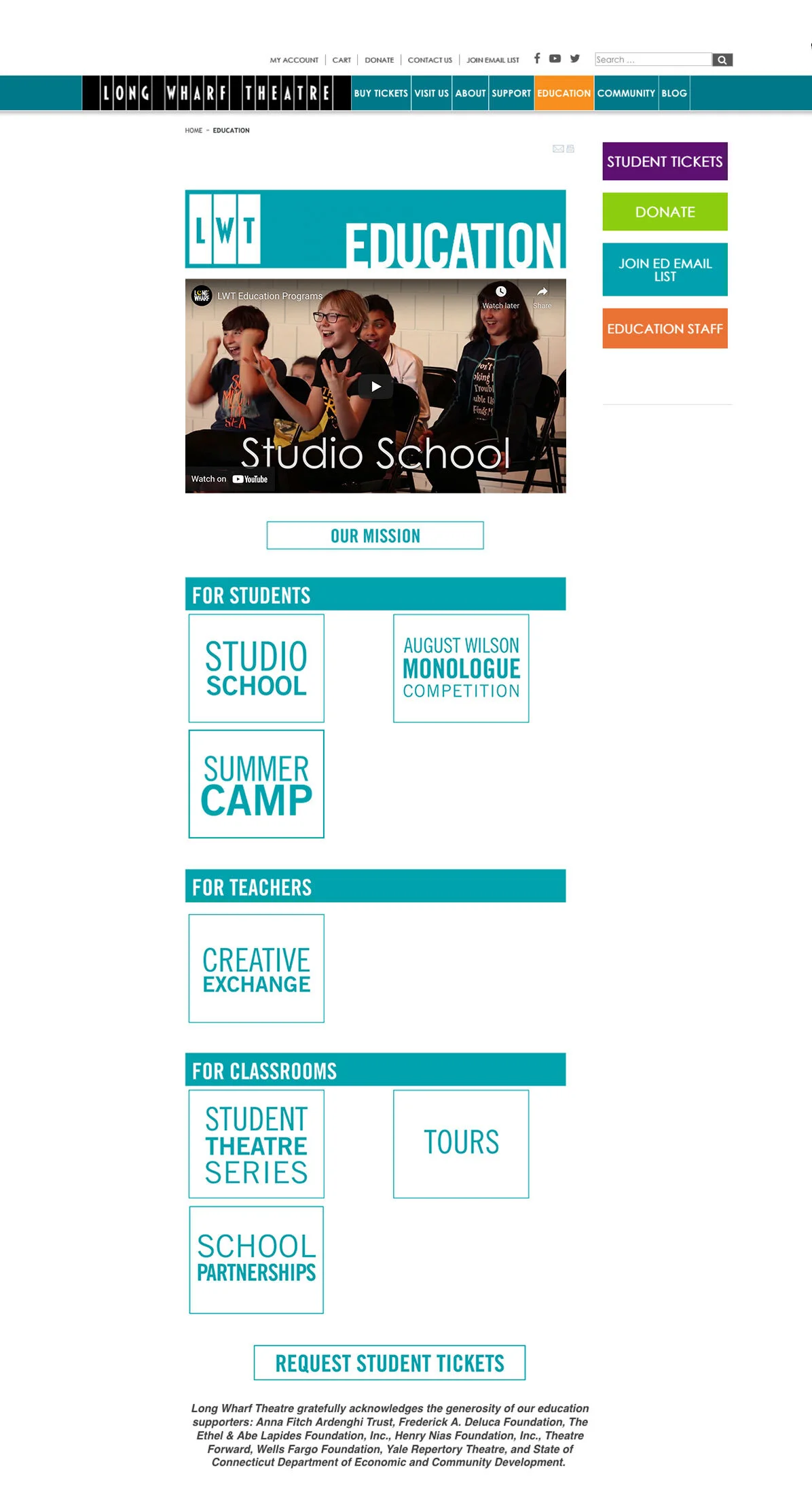
The first decision I made was to redesign the information architecture to reduce the size of the secondary-level menus from sometimes in excess of 10 items to a more manageable 3-6 on average. I also eliminated tertiary-level local menus and changed labeling on a number of menu items to provide more clarity to users and prioritize the most commonly sought content for users.
Original Site Map
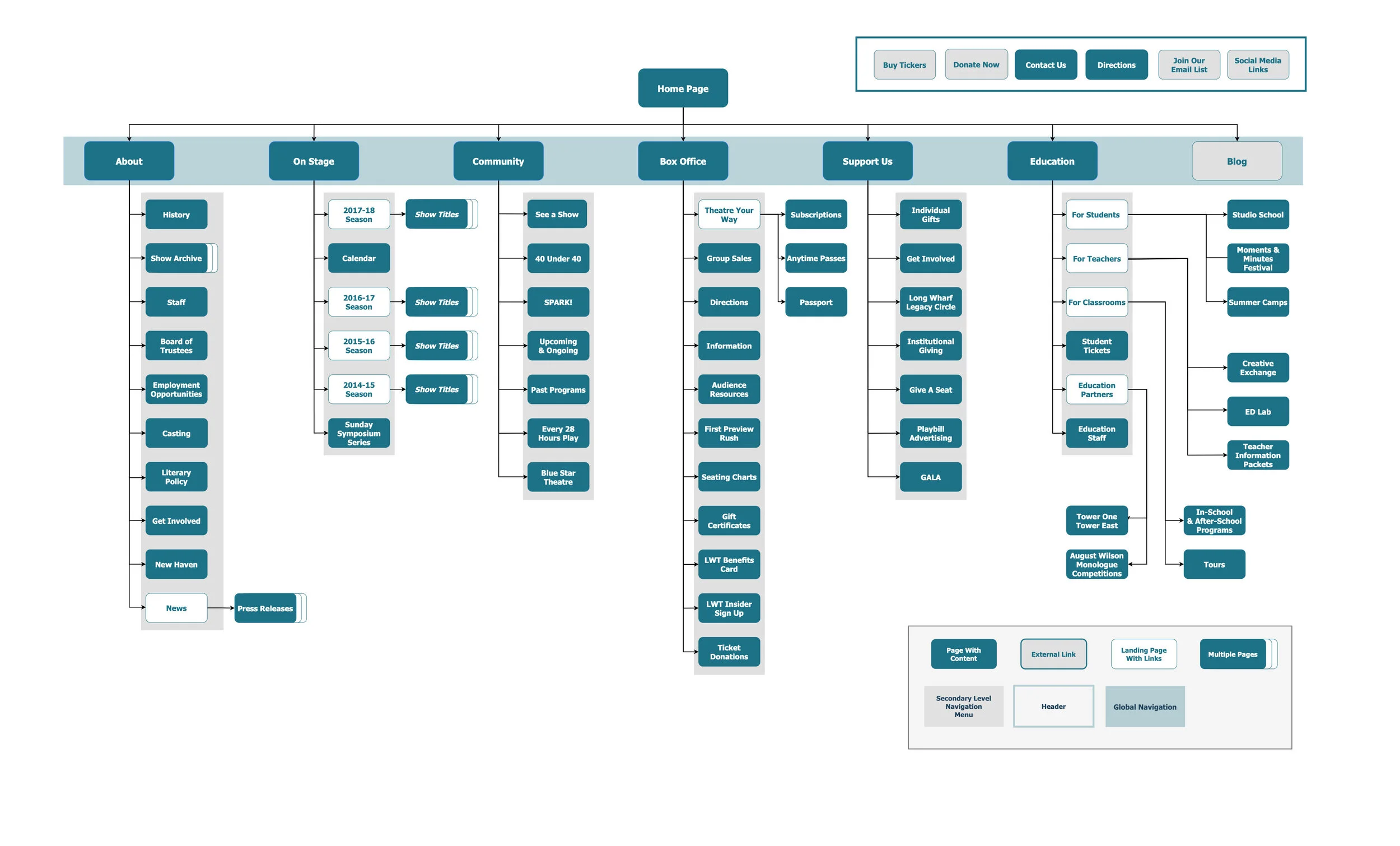
Redesigned Site Map

To reduce the number of pages and menu items, I consolidated content, removing what was outdated and rarely accessed. Then to reduce reliance on local navigation I revamped the page layouts of section landing page to consist of more content in scrollable sections rather than a small amount of content above the fold.
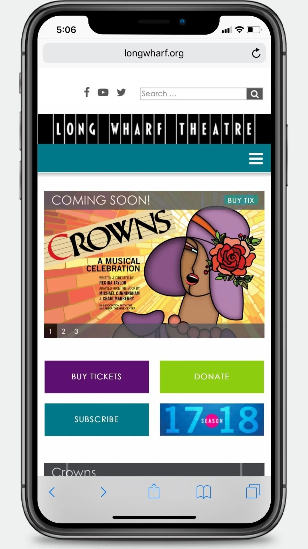
After
Before


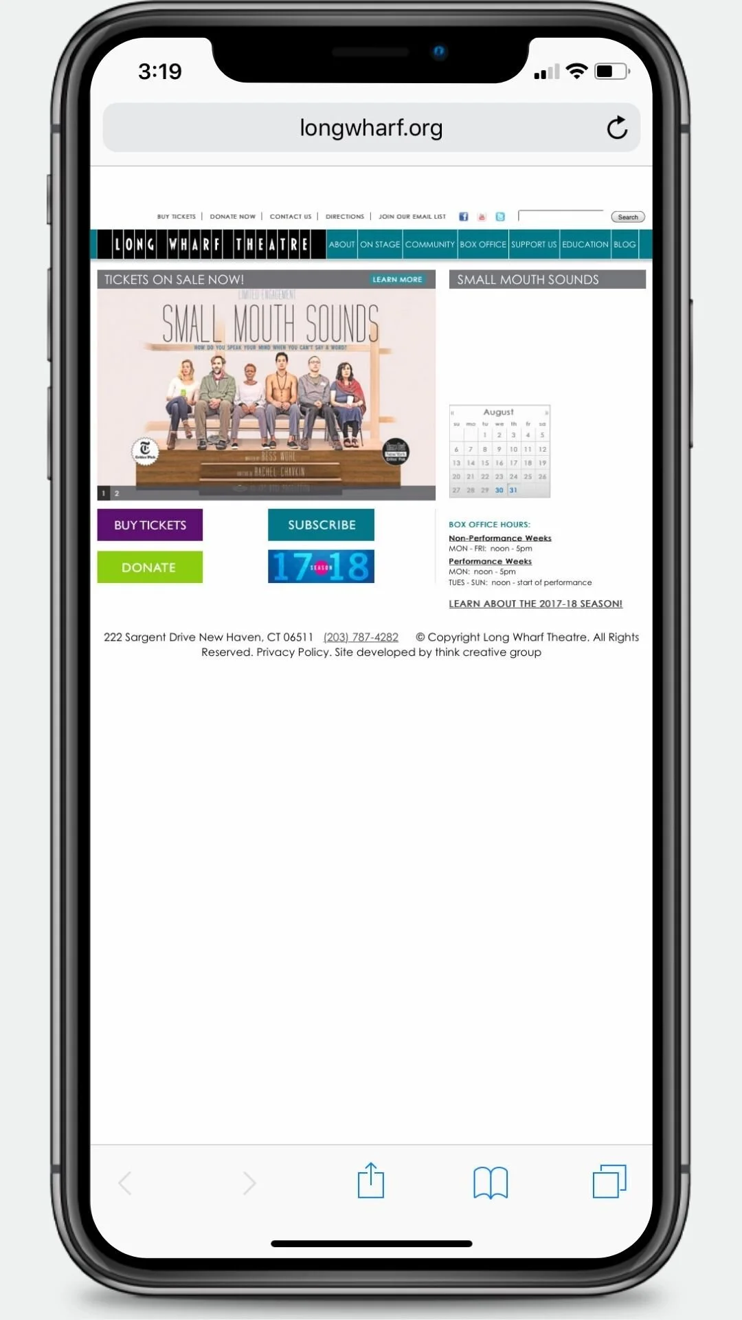
After
Before

To solve the placement of the side menus on small devices, I worked with the external web development agency doing the CMS replatforming. Options we came up with included dropdown menus, horizontal scrolling menus at the tops of pages, and creating accordion menus under global navigation items in the hamburger menu. Ultimately, the accordion design was chosen because it required the least development hours to implement. This choice made it all the more important that I was reducing the size of secondary-level menus so there would not be long scrolling lists in the hamburger menu.
Launch & Results
My design and content changes launched with the new ticketing system and responsive CMS in time for the opening of Long Wharf’s first show of the new year.
Over the first 6 months following the changes no significant usability or navigation problems were identified for Long Wharf patrons. Internal users did experience some problems locating information because they were so used to the old content organization and labels, but a little assistance and explanation for why changes were made cleared problems up quickly.
In that 6-month time frame calls to the box office for help locating information on the site dropped 50% and mobile traffic to the site increased by 10% with a 20% increase in the average time this user segment spent on the site.
My design changes allowed the old design to work for the theatre for another 2 years before a full site redesign was finally possible.