Milford Resident App
A companion app combining government and community resources to improve the resident experience.
The Problem
Government websites are renowned for being the worst. Residents are dumped onto a site that’s trying to do everything for everyone and made to wade through a mass of pages and content to complete what are usually simple tasks like paying taxes or learning how to request a copy of a birth certificate.
What if information most pertinent to a city’s residents could be isolated away from the rest of the noise on a government website?
The Solution
To tackle this problem, I started at home by designing a companion app for the city of Milford, Connecticut’s municipal website with an exclusive focus on the needs of the city's residents.

Research & Ideation
I started by brainstorming and interviewing other city residents about why we interact with our city’s government and what it means to be a Milford resident. As this research was being done during the beginning shutdown of the coronavirus pandemic, it quickly became clear that community and government resources go hand in hand in creating a good resident experience. Residents were looking to the municipal website for public health updates and new remote procedures for government business while they were also looking to local social media groups for ways to donate to food drives and to find out what restaurants were open for takeout.
Findings
The idea for the app evolved from strictly an on-the-go resource for residents to connect with their city and conduct government-related business to one that integrates community-related functions in order to improve the overall resident experience.
Based on user research the primary functions of the app were identified to be:
Online submissions of payments and requests for city government records and services
Discovery of local events and businesses
Delivery of various types of city communications, including emergency alerts, street closures, event reminders, etc.
Initiation of contact with local municipal departments and representatives from all levels of government
Planning of transportation and activities within the city
Centralization of digital access to resident resources, including library catalog/account, recreation, and adult education class registration
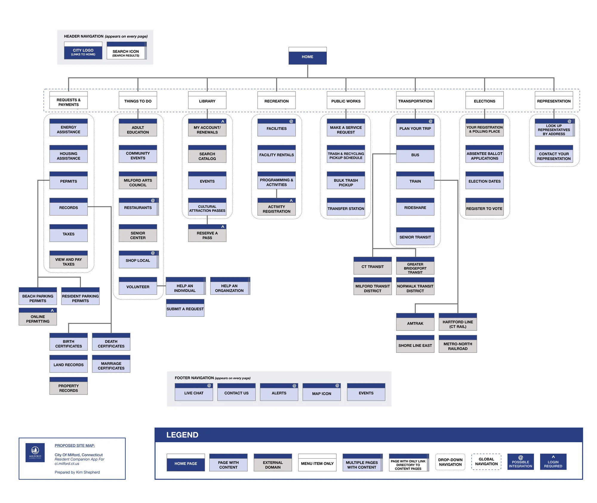
Information Architecture
To begin the design of the app I first created a site map of the current Milford municipal site to get a base understanding of everything included on it.
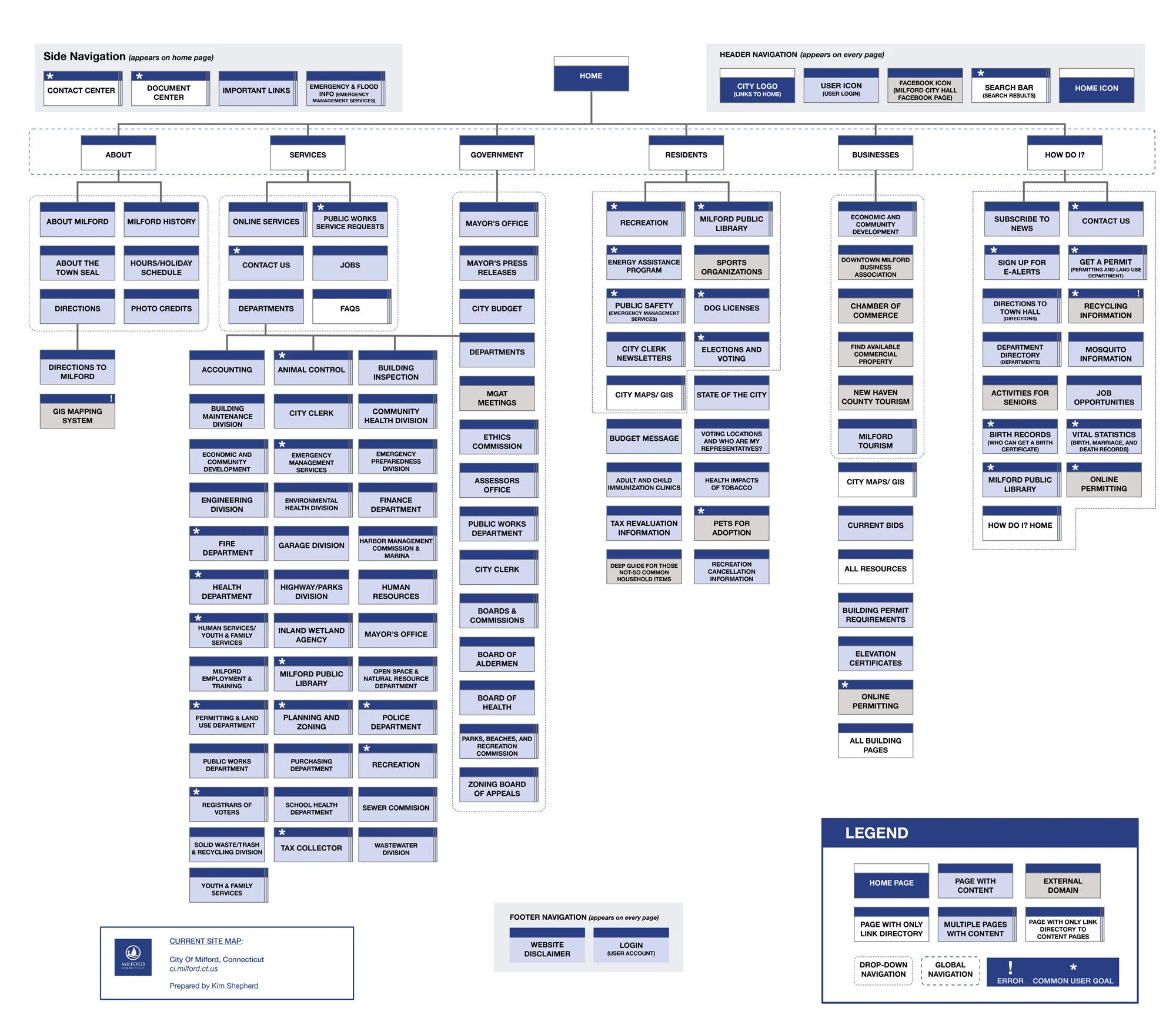
I then redesigned the information architecture of the site focused on the needs of resident users.
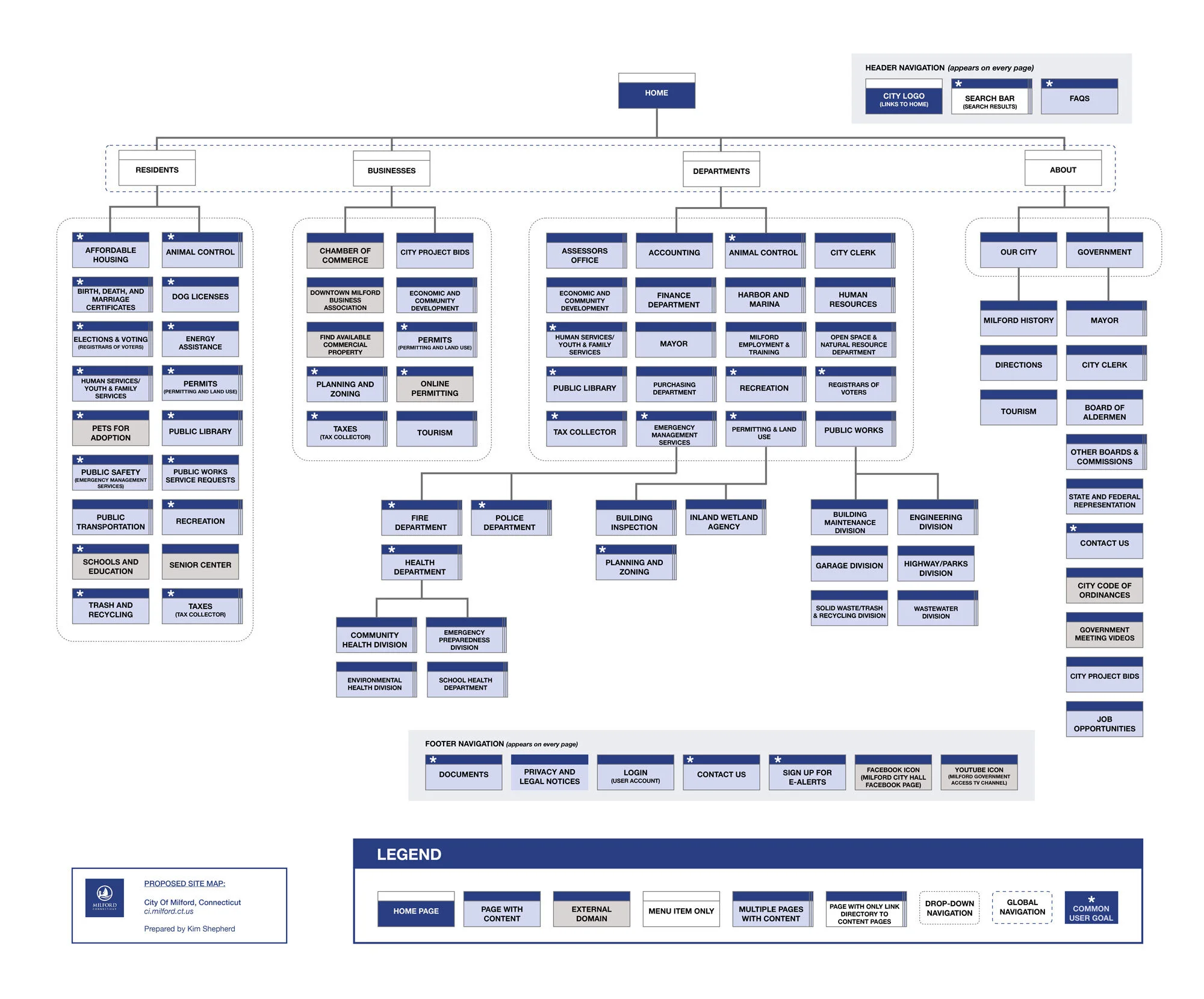
This site map served as a jumping-off point for the requirements of the app's site map. The app's IA boils down the resident-related content in the city's website to focus largely on action items, such as the tax payment portal and Public Works request form. It also adds in the common community-related actions, such as finding businesses and transportation, identified through user research.
Personas
With the site map defined, users flows were created using 3 personas I developed from user research.

Lena
Age: 29
Education: PhD student
Occupation: College instructor
Residency: Moved to Milford 6 months ago and does not have family in the area
“As a new, busy resident of Milford, I need to pay my taxes online so that I can avoid standing in line at the Tax Collector's office during limited business hours."

George
Age: 68
Education: High school
Occupation: Navy (Retired)
Residency: Born and raised in Milford and most of his family still resides there
"As a lifetime resident of Milford, I need to submit service requests to Public Works so that I can help do my part in keeping the town maintained and proud."

Teresa
Age: 49
Education: Bachelor's Degree
Occupation: Small Business Owner
Residency: Has lived in Milford for 18 years with husband and kids
“As a small business owner in Milford, I need a directory of other Milford-owned restaurants and businesses so that I can be sure to always eat, shop, and support local."
User Flows
The 3 user scenarios created for the user flows involved some of the more complicated yet common experiences users might have on the app:
Paying taxes
Submitting a request to Public Works
Searching and making a reservation at a local restaurant
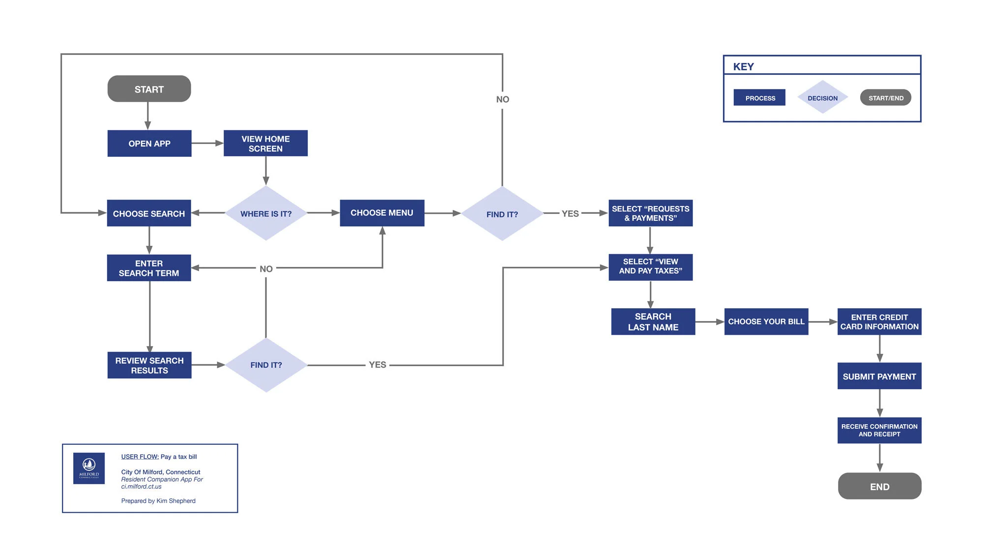
The flows introduced the idea of multi-route navigation for tasks as the preferred IA design whenever possible in order to better accommodate the wide spectrum of users the app will have. I expected that a user pool made up of all residents in a city would vary in technological fluency and comfort. I determined that meeting the expectations of as many types of users as possible was key to the adoption and success of this app.

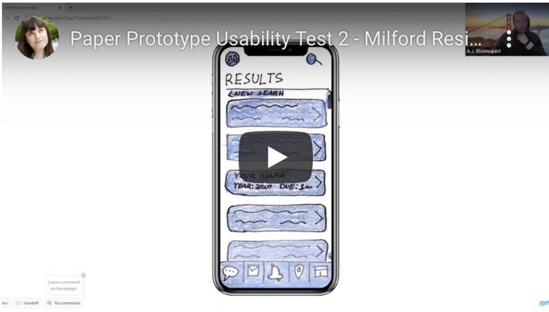
Low Fidelity Prototyping
I began exploration of UI design with low-fidelity paper prototyping.
The 3 scenarios outlined in the user flows were built in full for this prototyping round. There was also interest in exploring and testing some of the special features included on the app's site map so live chat, contact, and the interactive map were also sketched.

The biggest decision made during paper prototyping was to forgo unique home screen content and focus the home screen on presenting the app's global navigation.
This decision was made after a content audit of the municipal website revealed there wasn’t unaddressed content left that warranted appearance on the home screen nor were there resources available to generate and update any new content types for the home screen.
Usability Testing
I used the paper prototypes to conduct usability testing to explore and understand how users navigate through the app. During this testing, users were asked to complete 4 tasks, 3 0f which were explored in the user flows.
Because of social distancing guidelines in relation to COVID-19 , testing was conducted remotely using Zoom video conferencing. The Marvel Prototyping on Paper (POP) app was used to deliver the prototypes to users digitally.
Overall users in both testing sessions described the app as friendly and easy to navigate. Insights gained from the sessions included:
The chat feature was a welcome option for users. Investment in the feature to allow more immediate communication could enhance user experience.
As suspected, the design choice of multi-route navigation is needed in order to make the app's navigation align with the mental models of a wider section of users.
The label "Things To Do" possibly needs revision as it caused more hesitation in users than the other navigation labels.
Integrating the map feature into other areas, such as when reporting a problem to Public Works, could be useful for some users
Some screens were unnecessary and user flows can be tightened up in the next round of prototyping
Visual Design
For the app I wanted to expand on the feel of the city’s new logo and emphasize the vibrant coastal identity of the city through color choices and local photography.
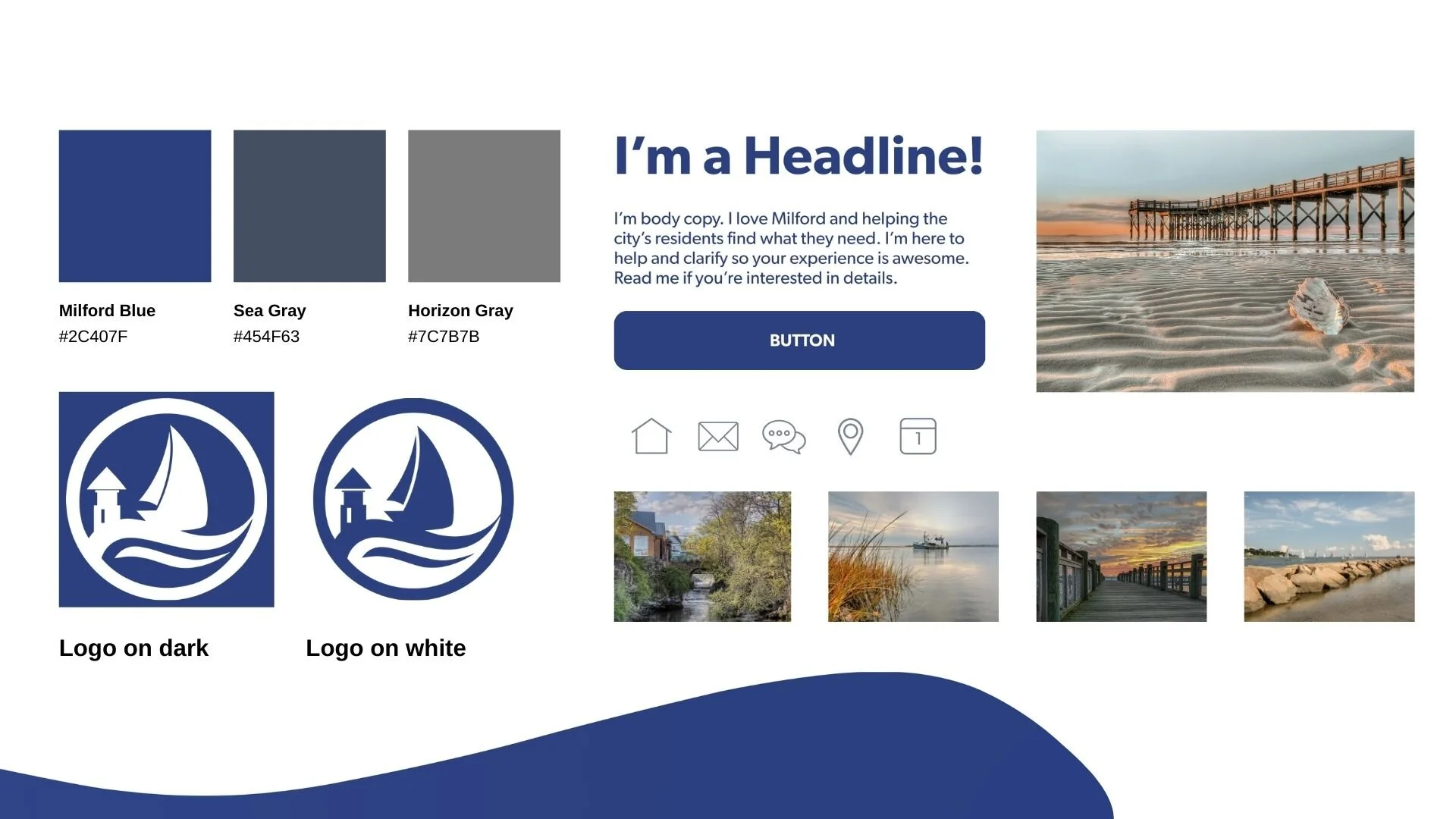
Photos courtesy City of Milford, CT
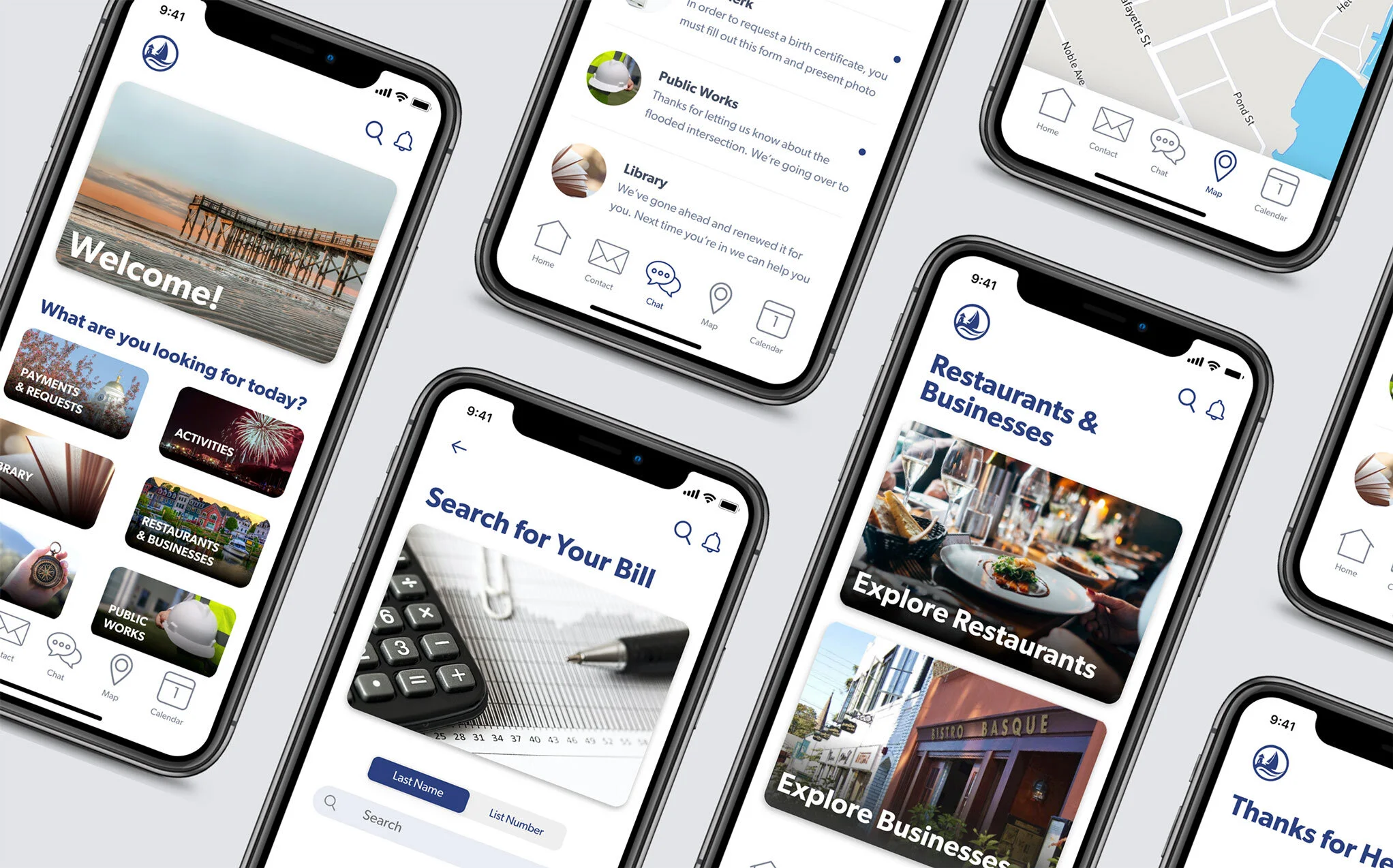
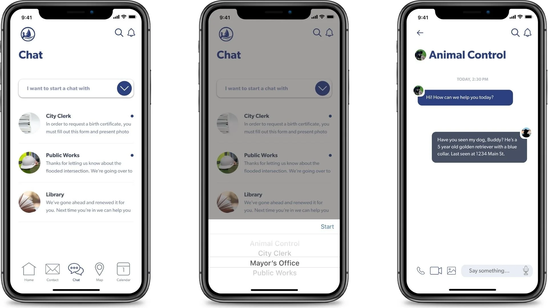
High Fidelity Prototyping
I used Adobe XD to create a high-fidelity, interactive prototype encompassing the design changes identified in usability testing.

In-app photos courtesy City of Milford, CT

Changes made in the high fidelity prototypes included:
"Things To Do" category was split into "Activities" and "Restaurants & Businesses" in an attempt to add clarity
Unnecessary screens, such as the landing screens that came before users made a tax payment or viewed restaurants that did not have a strong content strategy, were eliminated
A home button was added to the bottom navigation
The upper-left logo changed from a home button to a slide-out menu of the global navigation and includes the city's social media and website, the app settings, terms, and privacy information
All dropdown menus were changed to slide-up picker menus
A phone option was added to the live chat feature, similar to voice call options in messaging apps such as Messenger and WhatsApp, to accommodate users who prefer phone calls
Users can live chat through the app with government offices
Users can find specific places in town and directions to them
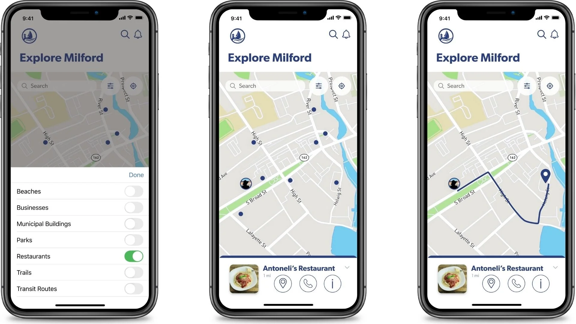
Users can make tax payments to the city

Users can report problems to public works

Users can find restaurants and other businesses

Users can send contact requests to government offices and officials

UI Animations
For the app’s UI animations I took inspiration from the branding and incorporated a wave motion for opening and closing the side menu and included the city’s logo as the loading animation.

Reflections & Next Steps
The City of Milford offered good source content for designing an app like this, which made the overall project a very enjoyable experience.
The next step for this project includes another round of usability testing with high-fidelity prototypes to learn how users respond to this design direction and whether navigation changes have improved the ease of use of the app. It would also be valuable to learn what impact the new features introduced in the high-fidelity stage have on user experience.