Scratch Baking Website
A new website design to better express the brand identity and improve the online sales experience of a small bakery cafe.
The Problem
Like many small businesses, Scratch Baking found their fate suddenly dependent on their very basic website when coronavirus shut down the world. While a quick pivot to develop online ordering was necessary, the user experience of this solution was less than ideal.
How could this small bakery turn this rushed expansion into an opportunity to increase the impact of their digital storefront going forward?
The Solution
I decided to do a redesign of the site to improve user experience with a focus on navigation and content strategy that could make the site more of an engine for sales and match the brand customers were interacting with in-person.
Research
To understand the problems with Scratch’s current site I conducted usability testing with a group of Scratch customers and new users.
“I’m looking at the menu but there’s no way to order.”
— User Comment
Findings
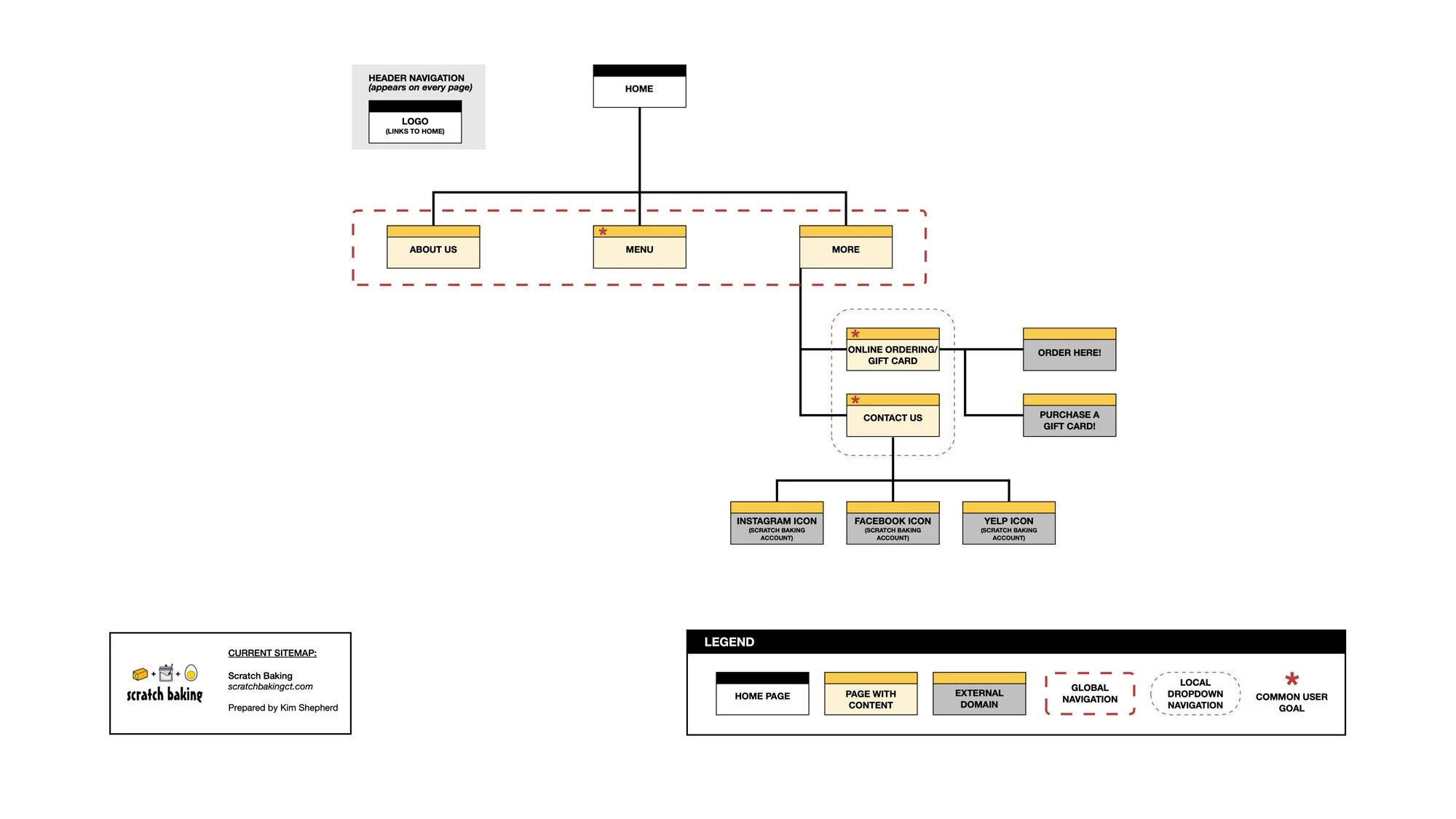
The link to order online was buried under the vague menu label “More” and users could not easily find it
There was no connection between the “Menu” page and online ordering
One single page listed everything on the menu with no ability for users to go directly to the category they are most interested in
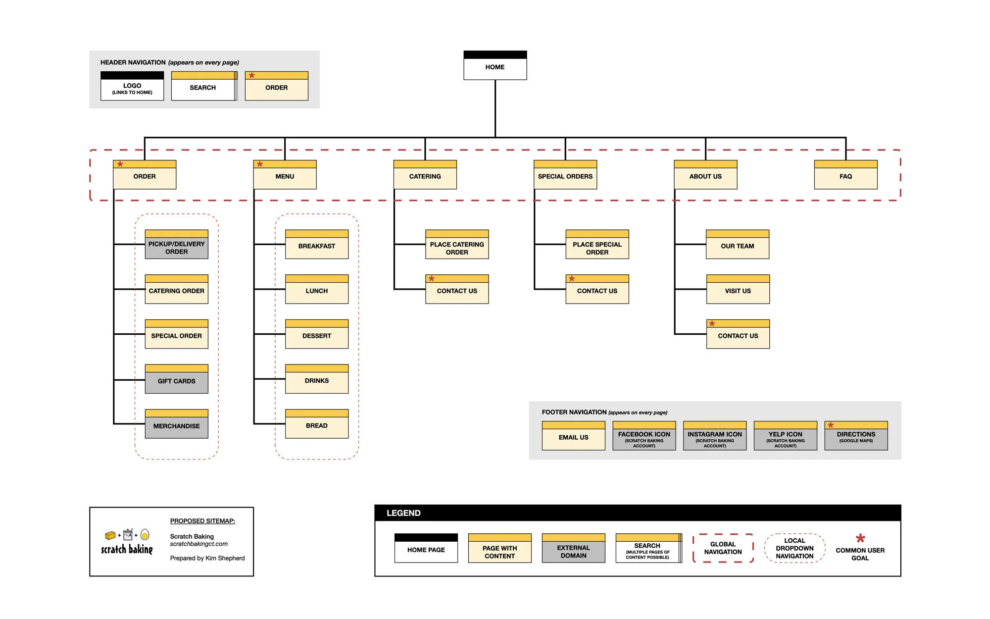
Information about catering and special orders did not have a dedicated page, there was no content anywhere informing users that this is an option, and there was no online ordering capability for these types of orders
Links to the business’ social media accounts were only available on the homepage or under “Contact Us”
There was very little brand identity, including logo and brand colors
Product photography was underutilized
The only option offered for users who had questions was to call or email
Personas
I developed 2 user personas based on insights from my research to guide design and content decisions going forward on the project.

Regular Rachel
"My work schedule is jam-packed. If I don't have an easy option for lunch I'm bad and just skip it."
About
Age 52
Annual household income of $200,000
Senior project manager at a consulting firm
Commuted to New York City daily for 19 years to work in the finance industry, but joined an independent consulting firm 5 years ago and now works remotely at home except for occasional travel for client meetings
Married with 2 kids ages 16 and 19
Behaviors
Relaxed demeanor, but enjoys organization and keeping busy
Subscribes to and reads Scratch newsletter
Follows Scratch on Facebook and also regularly uses Pinterest for home decor and gardening inspiration
Goals
Eat breakfast and lunch every workday to stay energized throughout busy schedule
Spend eating out budget as much as possible at locally-owned and operated businesses
Challenges
Making time to prep and cook workday meals
Finding takeout places that offer a range of menu items (coffee, snacks, healthy breakfast, and lunch options)
Obstacles
Worried it will take too long to go and pick up order or won't be able to step away from work
Not an early riser and fears all the good stuff will be sold out early

Special Order Sarah
"My daughter's allergies can make it hard to find things like birthday cakes like the rest of the kids have. Not every place is willing or able to help."
About
Age 31
Annual household income of $95,000
Part-time pediatric nurse at a hospital
Worked full time as a nurse after finishing college until her daughter was born with health complications. She cut back to part-time to stay home to help with her daughter's development while her partner works full-time outside their home. She hopes to return as a full-time nurse once her daughter enters school.
Married with 1 child age 3
Behaviors
Quiet demeanor, but vocally passionate in her work as a caregiver at work and at home
Opts for customer service via live chat or messaging app
Uses Twitter and Instagram daily, pins cooking/baking recipes and children's activity ideas on Pinterest
Goals
Discover and buy food made from quality, natural, and/or organic ingredients
Find inspiration and advice as a baking hobbyist
Challenges
Daughter has allergies to certain food additives
Often busy with daughter, regular errands, and other responsibilities during normal business hours
Obstacles
Having to email or call to place a special order
Wonders if the quality will be worth the price.
Information Architecture
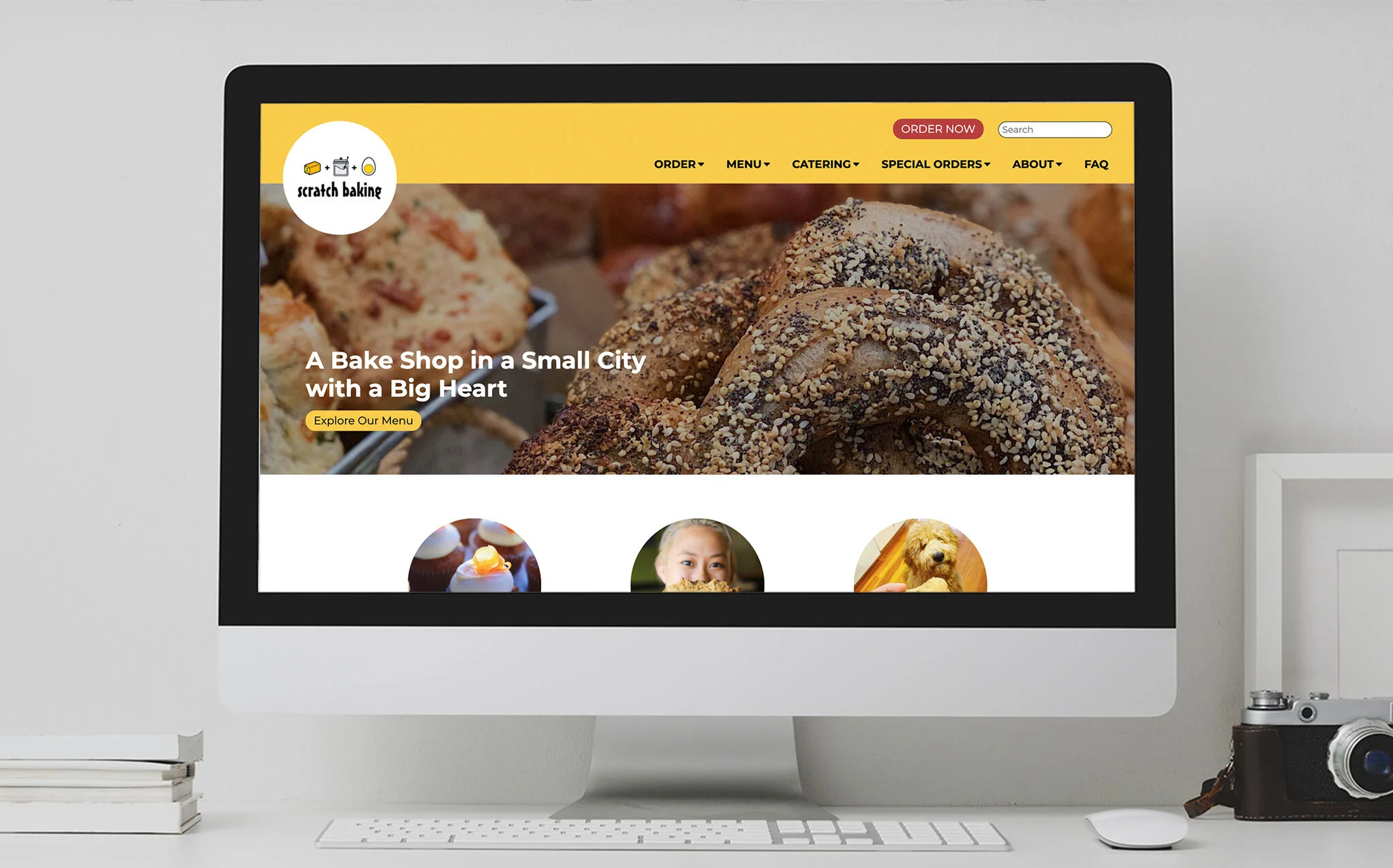
Scratch’s existing site was extremely simple, almost too simple, as was indicated by some of my usability test findings. The global navigation needed more options and better labeling and the site overall needed a more robust number of pages to better organize existing content and include new, missing content.
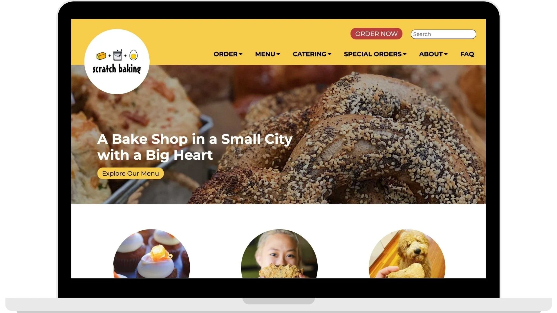
For the redesign, I included headers and footers to accommodate new buttons for search and ordering and to offer always-present contact and social media information. I expanded the global navigation menu from 3 to 6 options, placing “Order” as the first option to address the problem of this function previously being hidden under the vague label of “More.” Menu sections were also allocated to catering and special orders to improve user awareness of these options.
Wireframes
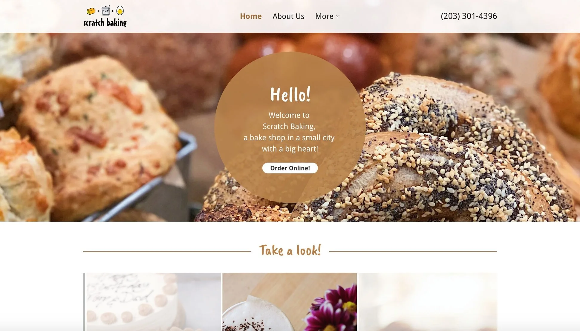
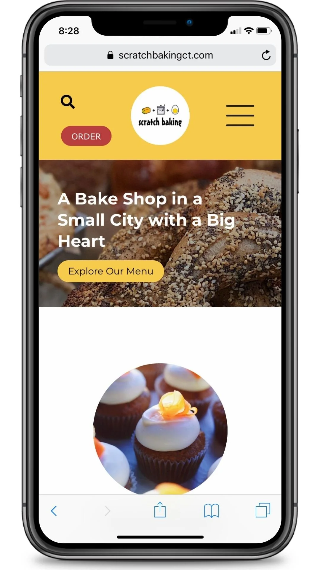
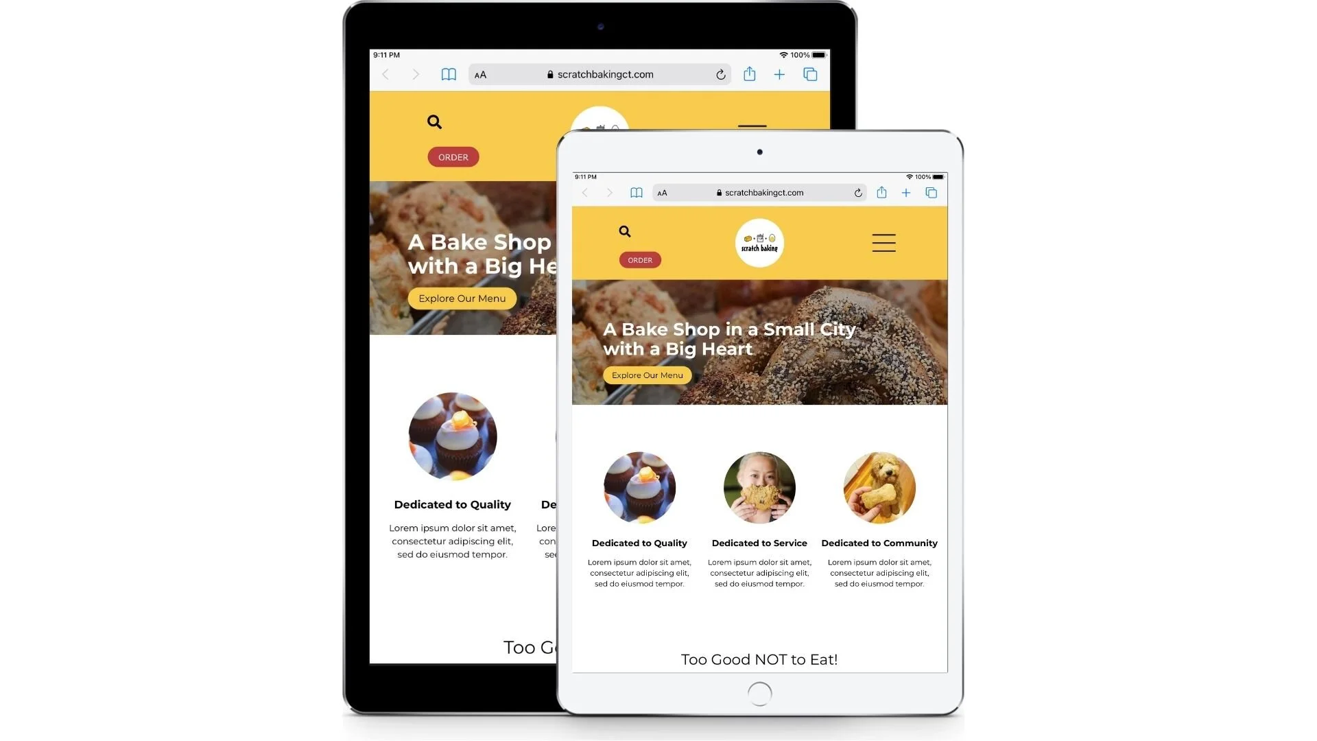
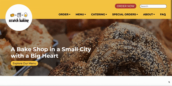
I used Adobe XD to create both mobile and desktop view wireframes for the site. Mobile design was important because Scratch depends heavily on on-the-go breakfast and lunch sales as well as uses Facebook and Instagram to drive sales of their products.
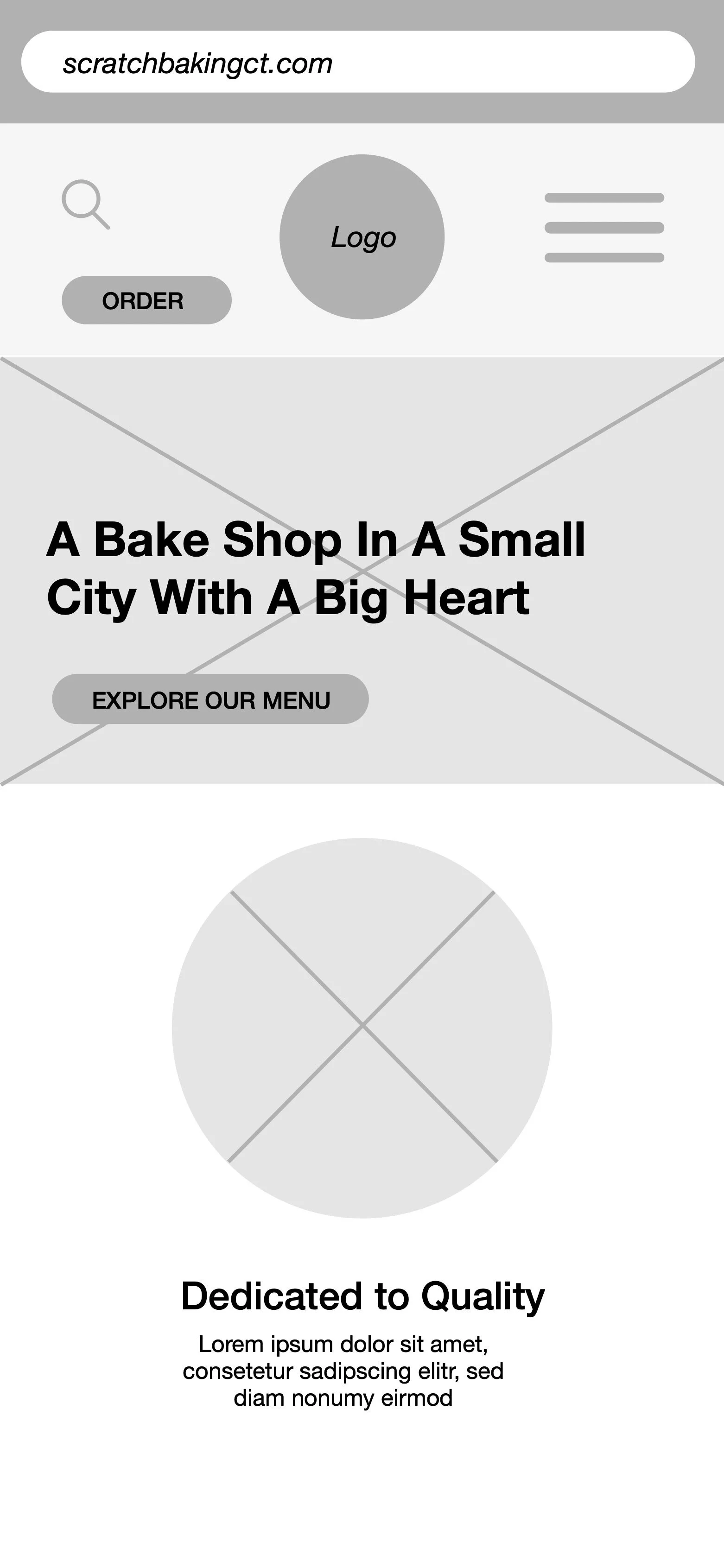
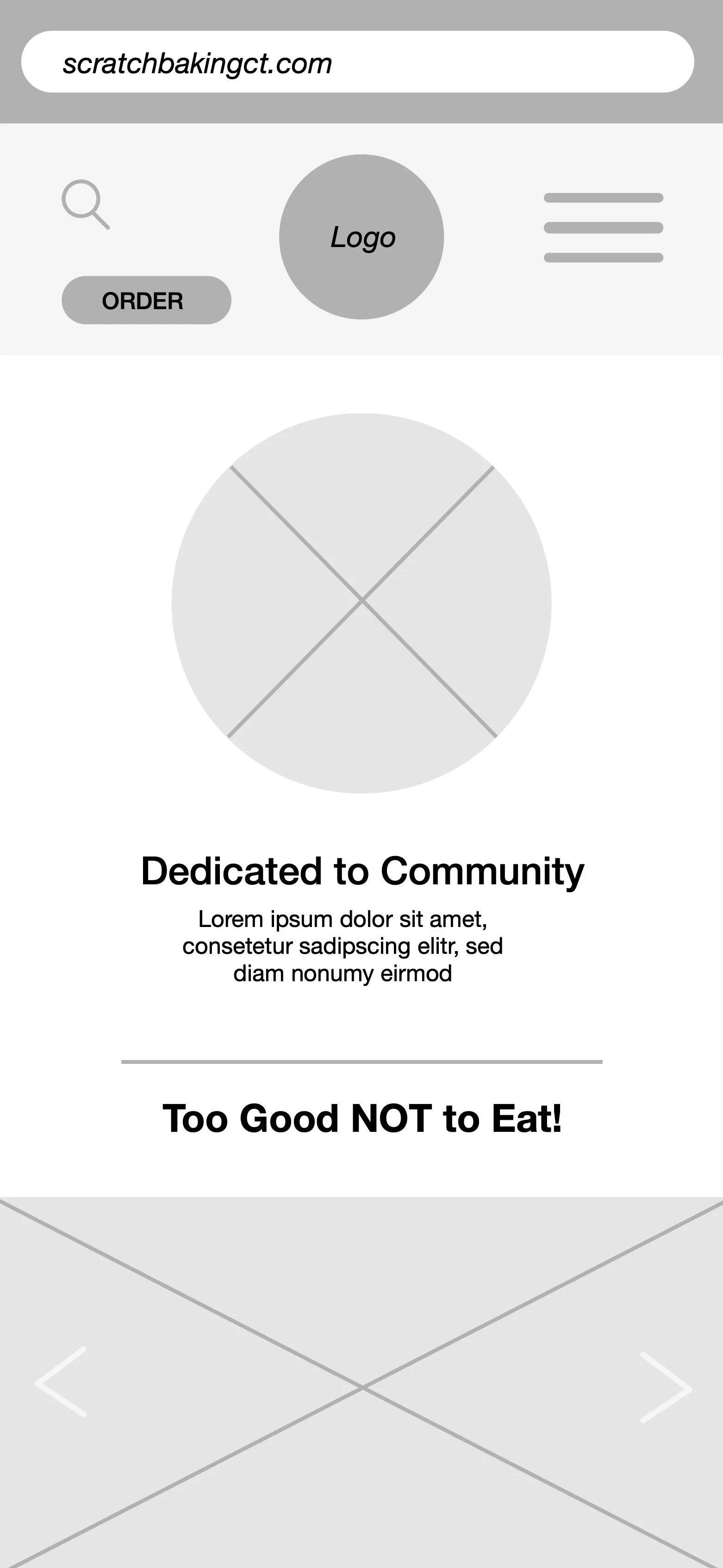

The wireframes were built mobile-first to ensure that Scratch’s on-the-go customer base would be able to browse the menu and order from anywhere. The bakery also relies heavily on social media marketing so a great mobile experience to drive traffic to from these platforms was a must.
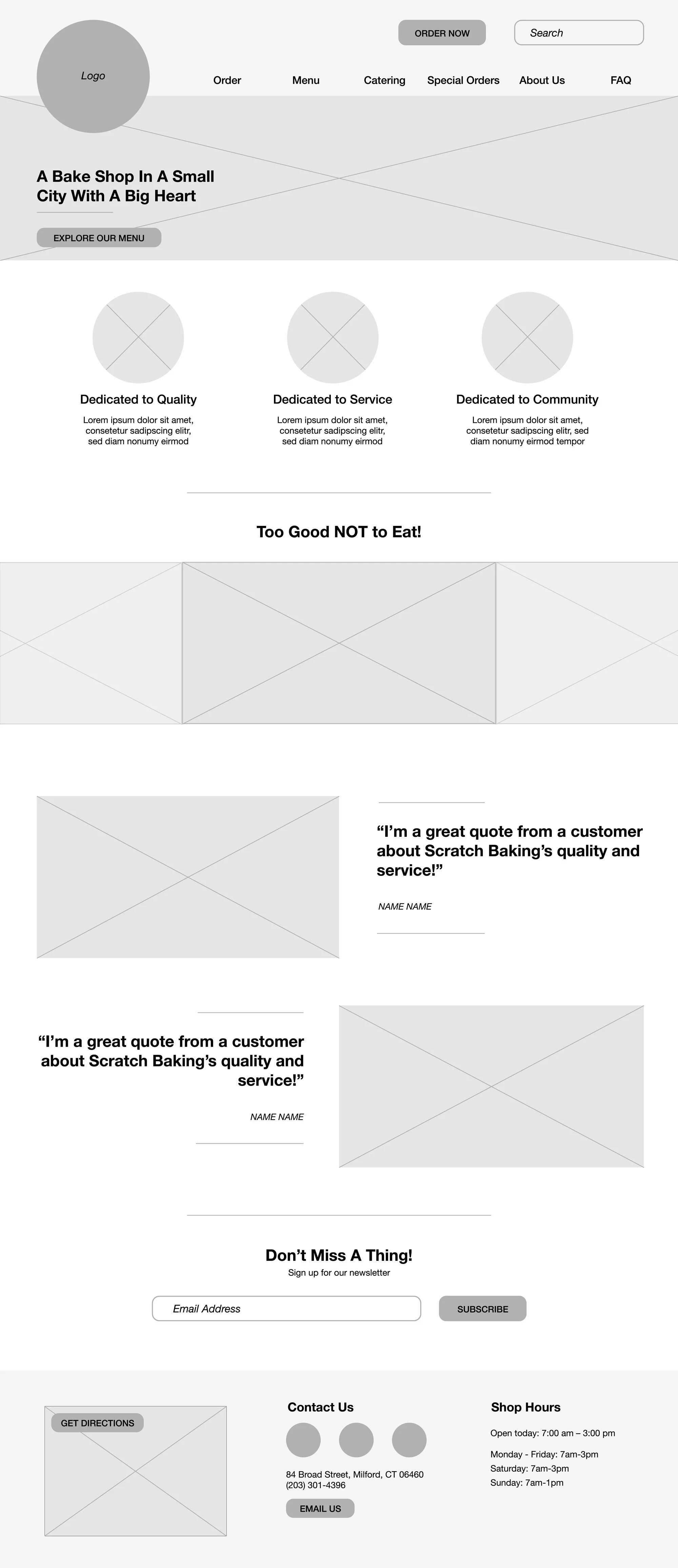
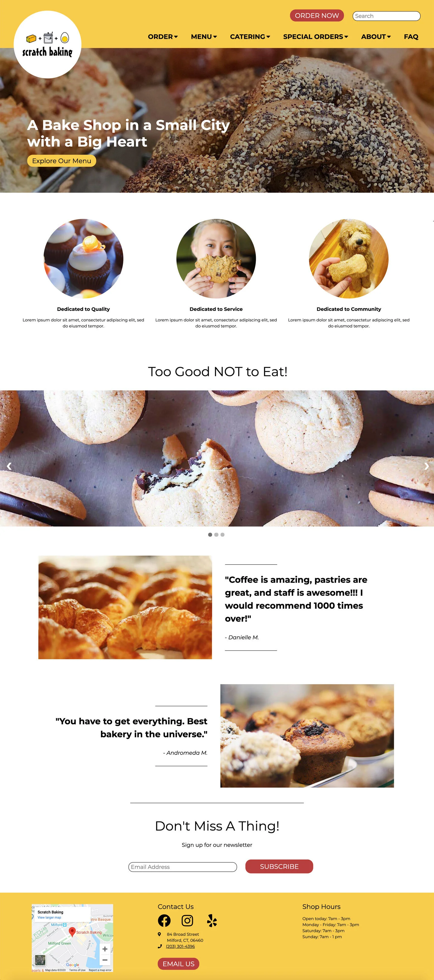
The homepage design is based on the content strategy I developed to introduce the brand and its products, enticing users to learn more or order. This is why I included a place to share the brand’s mission, a place to feature product photos, and a place to highlight customer reviews.
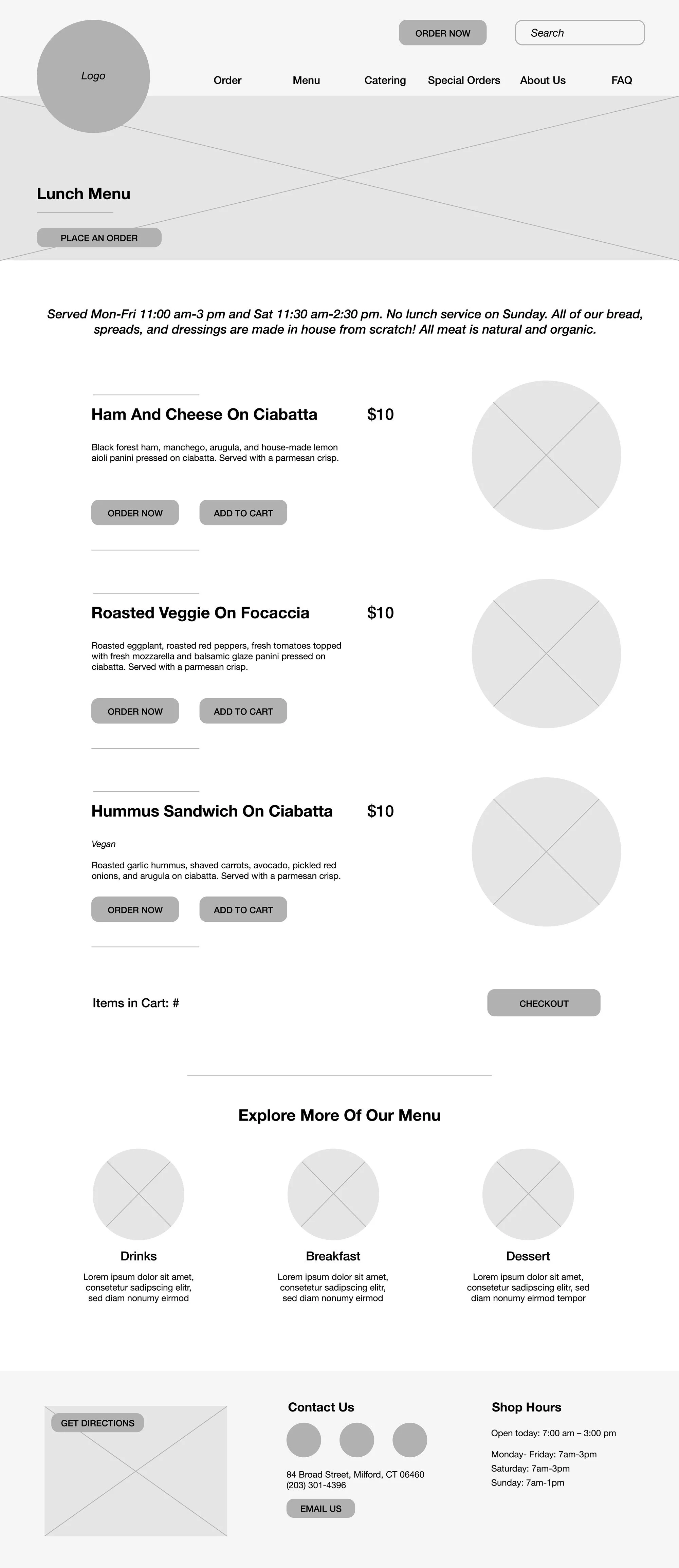
For a menu page design, I included pictures for each menu item because we really do eat with our eyes. I also included “Order” and “Add to Cart” buttons under each item. Should a user be interested enough at any point to want to commit to ordering they can take immediate action instead of switching to the order page.
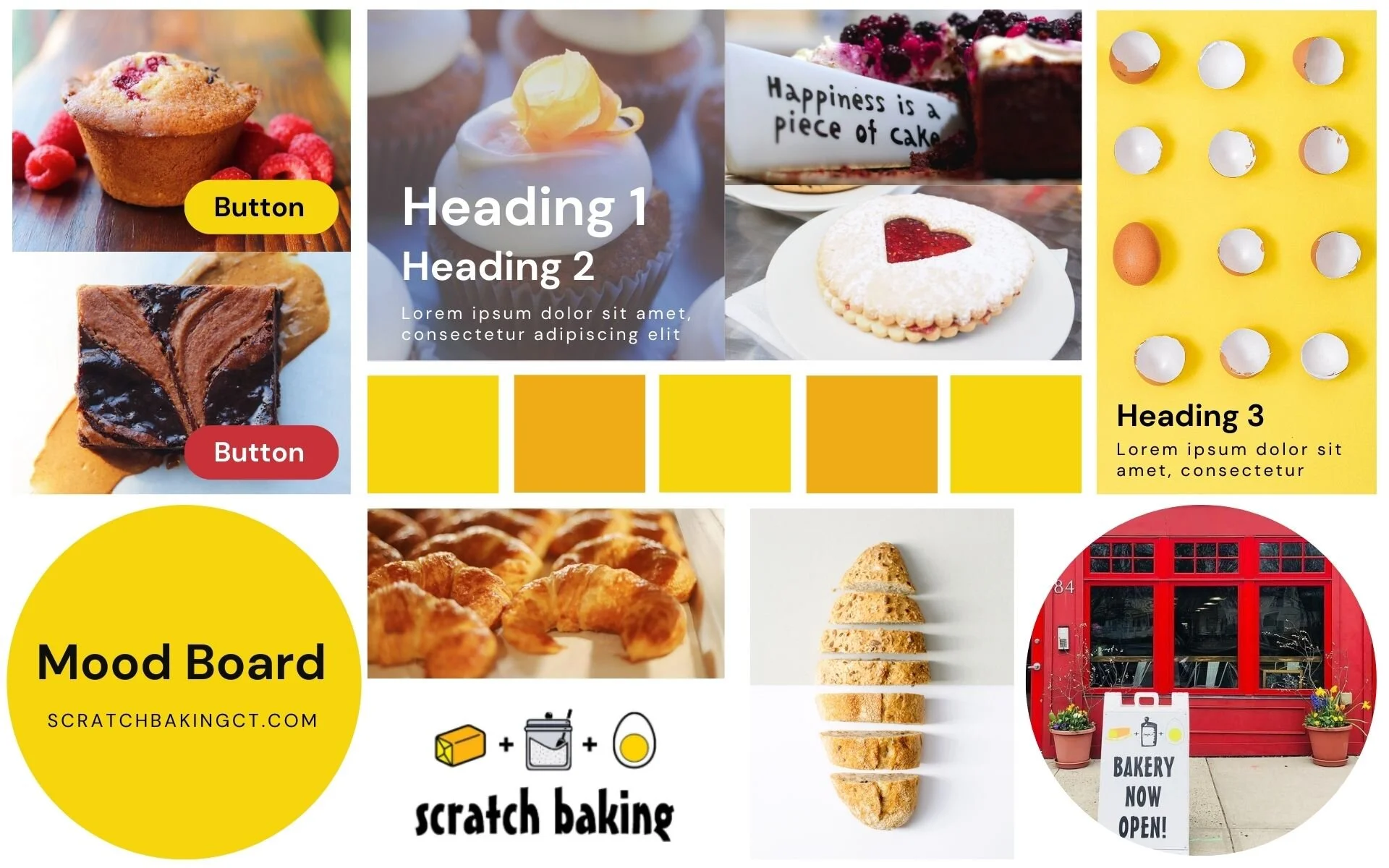
Visual Design
Drawing from Scratch’s logo, as well as their shop exterior and social media content, I developed a color palette and mood board.

Photo courtesy Scratch Baking

#F8CB4C

#B93E3D

#000000
Photos courtesy Scratch Baking
I focused on the emotions of happiness, excitement, enjoyment, and warmth because that’s what is often associated with eating baked goods. The brand itself is also very friendly, enthusiastic, and has a sense of humor in its voice and quirkiness in its logo. The brand’s existing product photography is of good quality and I wanted to include it in my design as much as possible to solve the deficit of photography in the current site.
Prototype
I mocked up an initial, responsive prototype of my homepage design for presentation using HTML and CSS.
UI Animation
Using a small amount of JavaScript, I included initial ideas for UI animations in the prototype, including the desktop header logo movement seen here.
Next Steps
The next phase of this project will include the design of more high-fidelity screens in order to create an interactive prototype intended for usability testing. The testing will focus on whether the changes in navigation and content solve the problems identified in the current site.